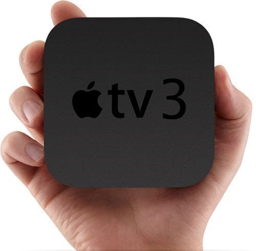
 Last month, I bought an Apple TV 3 primarily because I wanted to digitize my DVD library.
Why do such a thing? Well for starters, my DVD collection is somewhere around 800 discs. And that takes up a lot of space, especially in a Japanese apartment. I don’t have any cases here, I left them all back in Chicago. The discs themselves are arranged in sleeves in drawers, which means finding what you’re looking for is difficult. It also makes just browsing when you don’t have an idea of what to watch absolutely impossible. So while the process of converting the DVDs is a long one (although I’m close to the end), the ease of being able to access all my movies with the touch of a button is extremely convenient.
Why go with Apple TV 3 instead of Roku? I looked into them both, but Apple TV seemed like a better choice for my needs. I like the iTunes synchronization, and I like the option of customizing the metadata and the cover images. The downside is that iTunes only works with a specific media format — mp4 (or m4v as their extension is called).
Overall, Apple TV works great. I can also access Netflix and other web streaming services. I primarily use it for my movies and TV shows, which are not insubstantial. But I do have a few quibbles, mainly about the GUI.
Mac users may remember that Mac used to have this program called Front Row. You could use it for viewing your movie library as well as browsing things like movie trailers. The Apple TV also uses the Front Row format, and what Front Row basically is is you have the right portion of the screen with a list of all the titles and the left portion shows the cover art, description and any other information about the selected title.

Simple and boring
The thing that really boggles my mind about this user interface (UI) is that Apple is capable of coming up with something better. Hell, the ATV3 already has something better. Just look at this:

Now we’re getting somewhere…
Not only is this format much nicer to look at, but it’s also got a lot more choices for customized views. Each row is a different organization. Imagine something like this, with one row being alphabetical listing, another row being recent movies, another where stuff is sorted by rating, by genre, playlists, etc. Plus all the coverart is right there, which makes it a lot cleaner and a lot nicer to sift through, especially if you have a large library.
The problem here is that this format is only on Apple TV’s iTunes Store interface. For computer sharing with your own files, you’re stuck with the Front Row format. I have no idea why Apple would limit this for people, doesn’t make much sense to me.


See, now we’re talking. These two view options are iTunes grid and coverflow options, respectively. Apple has the coverflow option in iTunes and in the iPad, iPhone and iPod devices. So why have they not added it to Apple TV, or added it in a very limited capacity?
Why all this talk about how it looks? Because that’s pretty much my only gripe with the Apple TV. If Apple could put out an updated UI that gives people the option of switching the view (or at least the option to install custom skins), I wouldn’t have the slightest complaint.
Movies linked to my iTunes library play with no problems. I haven’t had any connection issues streaming over my wireless network. The HD movies I have play in perfect HD quality.
But the UI is annoying.
There is the jailbreak option, where you can install software that allows you to change the UI. Unfortunately, the jailbreak for the new Apple TV hasn’t been developed yet, the hackers are still working on it.
Apple, please correct this one, minor problem.

Nice review