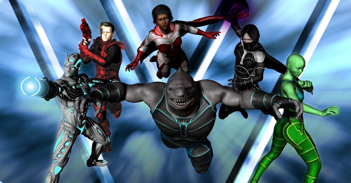
You may have noticed some new covers appearing for the Vanguard series. I recently made the decision to update the covers. I wasn’t quite sure how to do it. The first iteration of Season 1 featured comic book-style artwork by Mat Nastos and though it looked excellent, I got a number of comments from readers saying that it confused them. Some thought it was a comic book instead of prose and were thrown off. So I realized I had to do something different.
I looked at the cover art used on other best-selling superhero books and noticed that it was much more real-world. Almost none of them had the comic book-style, but instead adopted more of an urban fantasy approach. So photo manipulation or painted cover seemed the way to go. But painted covers are very expensive and I unfortunately couldn’t afford them. That left photo manipulation, which I can do pretty well.
But them the problem is how do I handle that? With most of the other superhero books, it focuses on a single character, so much easier to do. Mine is a team book, so what to do there? Do I only focus on one character at the expense of all others? And what do I do for the less-human characters like Sharkskin and Zenith? How to properly convey them on the cover?
The answer came in the form of movie/TV posters. Alphas was a SyFy TV superhero series inspired by the X-Men. For their promotional posters, they chose to combine headshots of the main characters in order to make the poster. This seemed like something that was doable.
Of course, I quickly realized I was at a disadvantage from Alphas. For one, I didn’t have the benefit of having the same lighting or background used for all the characters. And two, I didn’t have the benefit of being able to take multiple shots of the same models. Some models I was able to find more than one photo of, but others I couldn’t. So that meant I had to mix and match a bit, use other characters for successive covers.
That’s when I discovered DAZ Studio, a program used to create 3D artwork. The program is free to use and assets can be bought from their store. I played around with it for a while, ran through the tutorials, and then decided to buy some assets and use them in the creation of the new covers.
It took a lot of work. I was working at this almost from morning to night most days over the past two weeks. I’ll need to eventually invest in a more powerful computer to take full advantage of the program’s potential, but I’ve managed to do some impressive work so far. The background was created in Photoshop through a lot of trial and error.
Take a look and see for yourself.
Not bad, huh?
I’m really proud of these new covers and hope they lead to increased sales. I think they do a great job of conveying the tone of the books a whole lot more.
If you’re an author and you’re thinking of doing something similar, DAZ Studio can quickly get very expensive by buying assets. But I think it’s useful to learn how to do these different things, even if you’re only doing it for fun and not with the aim of creating your own covers.


Great cover man! I’ve read all of your Vanguard books and wanted to wish you good luck with your writing. Doing the cover yourself shows how much work and effort you put into it.
Thanks! Glad you like them. Help spread the word! At the moment, I only have plans to go up to five seasons, but if the books start selling well, I’ll keep putting them out.